A London coffee shop gets a homely visual identity
BRAND IDENTITY PRINT DESIGN

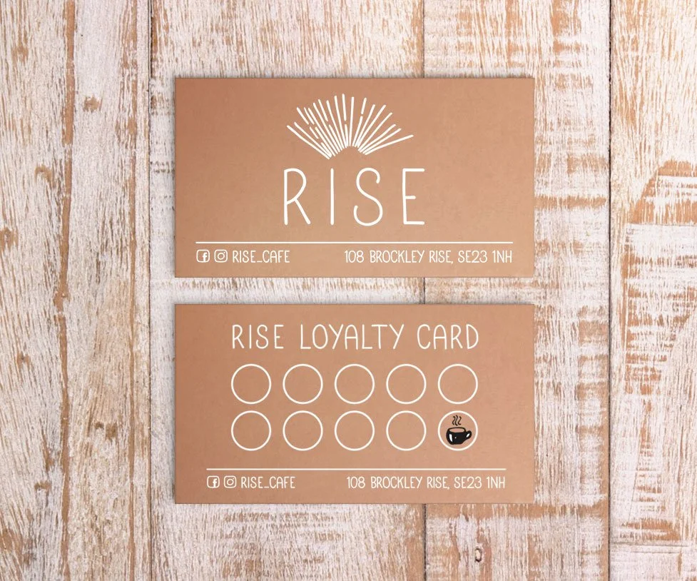
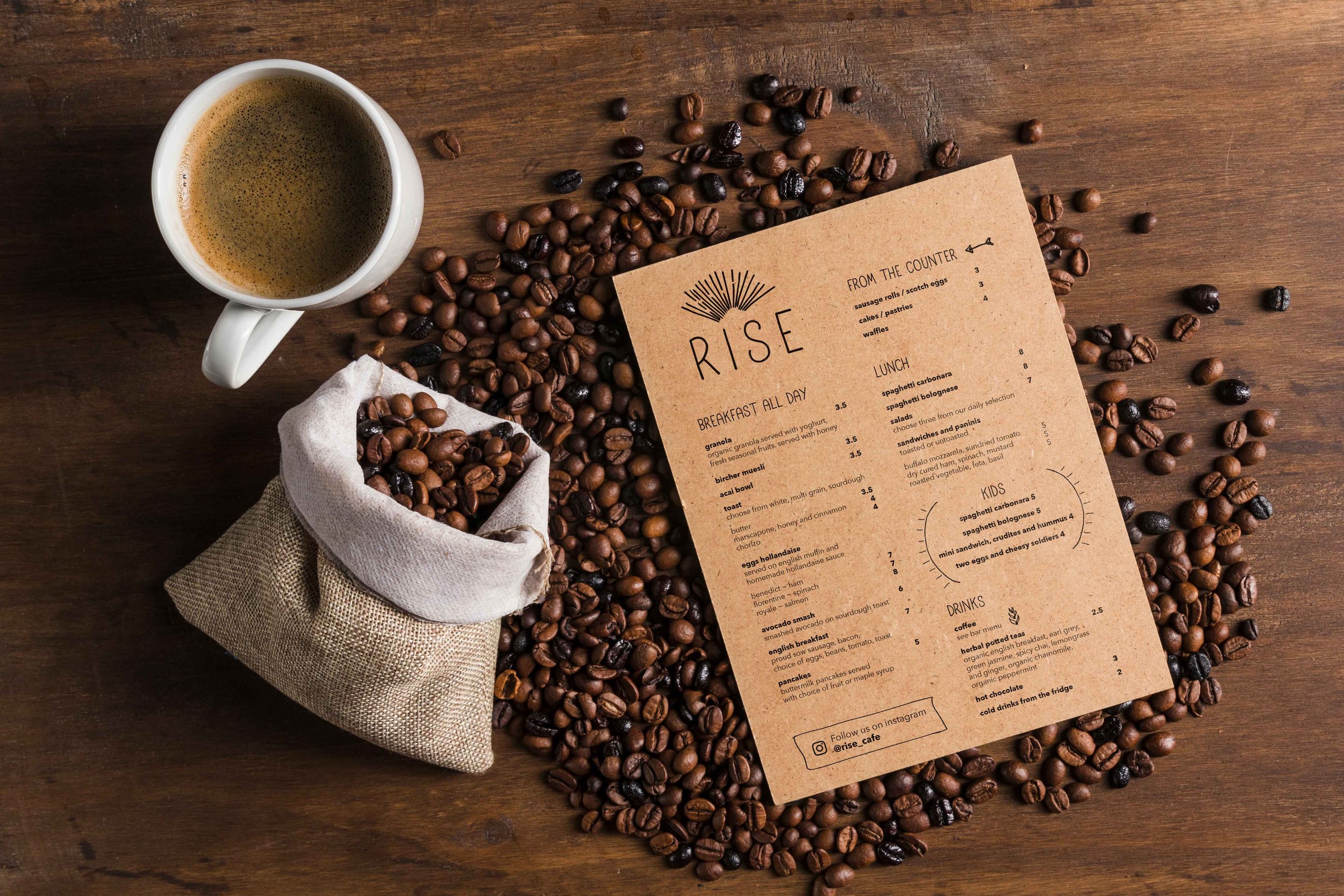
A family-run cafe in South East London needed a new brand identity. They wanted a branding concept that was personal, homely and welcoming that would exude the hygge vibes of the cafe.
To express this visually, Dot & Peg chose a creative route that incorporated hand lettering and a hand-drawn logo. With the cafe interior largely made up of reclaimed items including wooden tables and floors, this look was carried through outside with the signage lettering being hand painted onto real wood.
Dot & Peg also designed a custom font called Rise that’s used throughout the cafe’s branding.