
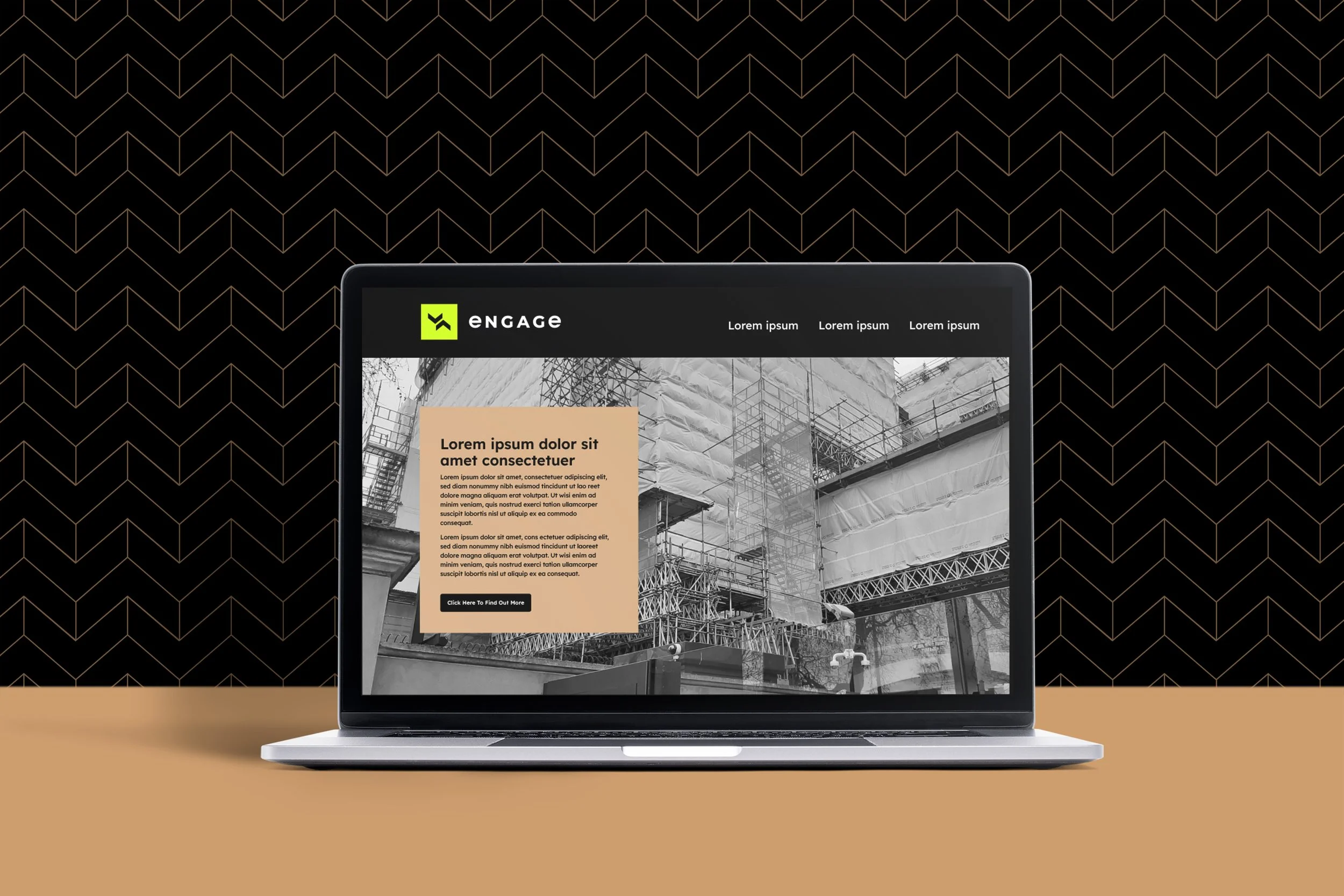
ENGAGE scaffold design and engineering
Intentionally constructed brand identity to attract customers at the higher end of the market.
Brand Identity
Print design
Signage
the BRIEF
New to the market Engage needed a new brand identity that would attract both clients and new staff. They needed to recruit to grow so we want the company to be a great place
to work that is both professional but fun, creative, and exciting.

The SOLUTION
The brand was to be bold and playfully disruptive. This brand values imperfection. It doesn’t take itself too seriously, radiating authenticity and an unfiltered, real-world charm that resonates with honesty and optimism.
The concept of ‘Making your mark’ captures the essence of a generation – Gen Z – that craves authentic, tangible experiences in an increasingly digital world. This approach brings vibrant energy to the brand, reflecting the diversity and creativity of the people it represents. The visual identity feels like a dynamic scrapbook: playful, layered, hand-drawn, and slightly chaotic, evoking a sense of nostalgia with an ‘old school’ aesthetic. It celebrates the imperfect and the real, inviting brands and audiences to engage with their genuine content.
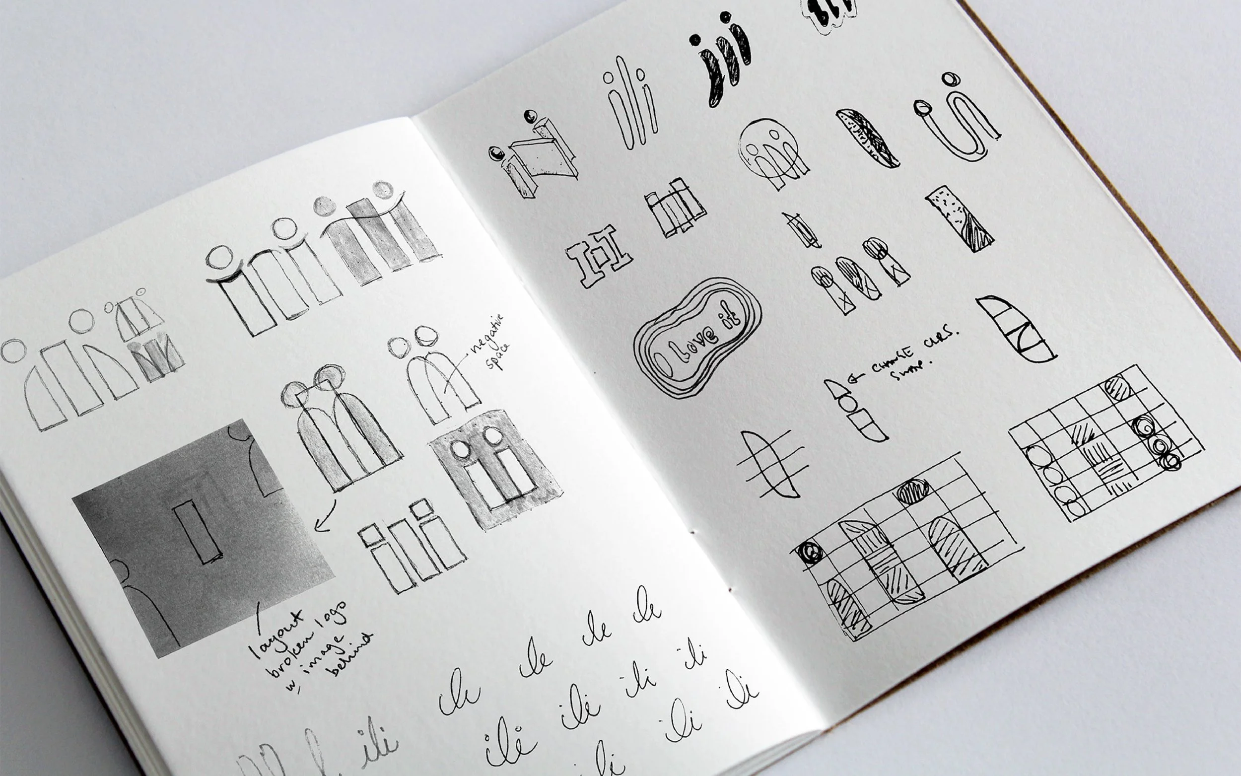
When developing the logo we wanted to capture the idea of recommendation in as minimal a way as possible. This resulted in us using lowercase ‘i’ characters that peek over the ‘l’ between them, much like neighbours talking over a garden fence.
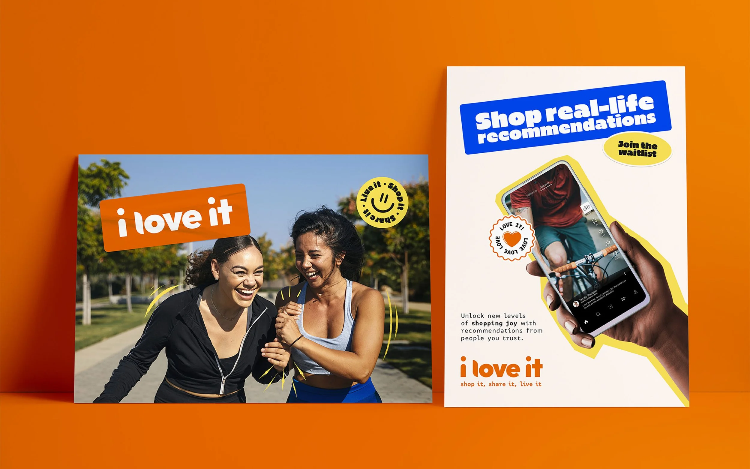
The photography captures a sense of freedom, showcasing people in a flow state, authentically expressing their passions highlighted with coloured ‘energy’ lines that pulse around their figures and highlight specific features.
The energetic colour palette combines vibrant orange with an eye-catching electric blue. These are complemented by soft lilac, yellow, and paper backgrounds. When it came to typography, we wanted to create maximum impact with our headlines. Dripping with character Gaude Wide came to the rescue. FF Attribute text was chosen for the body copy, alluding to the AI tech under the hood.
The retro sticker pack aesthetic gives ili a flexible and expressive tool kit in which to apply their playful ways to their marketing materials.


Designing a brand that feels professional and contemporary.
Overview
A mark-led identity that pairs a strong geometric emblem with a clean wordmark. It emphasises structure, forces, direction, and collaboration, communicating both precision and brand personality through a distinct icon that can stand alone or pair with type.
Visual Identity
The chevron symbol mark is composed of two chevrons, forming a unique, angular motif. Upward forces are essential for structural integrity and stability referencing the scaffolding and construction side of the business. The modular assembly is like interlocking scaffold components. There is human connection through the shapes which suggest interaction or back and forth. The directional marks gives a sense of motion and energy.


Typography
The wordmark uses a rounded sans-serif with a geometric base. The lowercase “e” references Eular’s number, a mathematical constant, and is balanced with the uppercase letters and the lowercase “e” also features in the tagline for consistency.
Layout & Composition
Grid-based structure underpins nearly all layout decisions — keeping the design cohesive and clear. Rounded corners soften the interface and conveys a gentle, inclusive design language and approachability. Hero elements are given generous space, while supporting content is nested in structured typographic blocks.
Pattern System
A dynamic chevron repeating pattern — derived directly from the mark — forms a grid. It’s visually strong and highly structured.
Colour Palette
Monochrome foundations: Deep blacks, crisp whites create a clean, timeless base. Muted neutrals and tan tones: Beiges create contrast with the black-heavy palette, softening the overall identity without losing sophistication. Highlight accents: Pops of neon yellow-green and bright violet introduce creative edge and call attention to specific messages or components. Minimal use of saturated color. These choices support a look that is professional, while remaining contemporary.
Imagery
Photography features black-and-white or high-contrast colour treatments.