
THE EXPEDITION
Building a brand as bold and iconic as Cleopatra
BRAND IDENTITY & SQUARESPACE WEBSITE
NAMING, COPYWRITING, ANIMATION
BRAND IDENTITY: Research & discovery
THE BACKGROUND
& THE BRIEF
The Agency Cleo is a 360-degree events agency driven to help clients create lasting impressions. Globally focused and forward thinking, they do the hard work so you don’t have to. No matter the size of your event, whether a conference, festival, networking dinner, exhibition or product launch, count on their energy and experience to bring it to life.
To build a brand as bold and enduring as the legendary Cleopatra. Known for her strength, intelligence, and captivating presence, Cleopatra has become a timeless symbol of power, elegance, and fierce individuality. My mission was to channel that energy into a visual identity that could stand tall in any landscape.
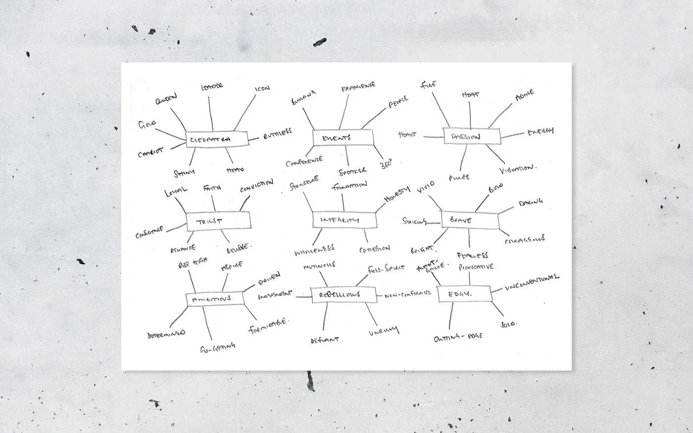
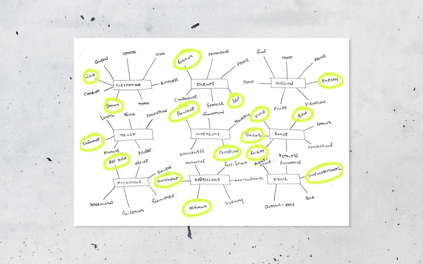
MIND MAP
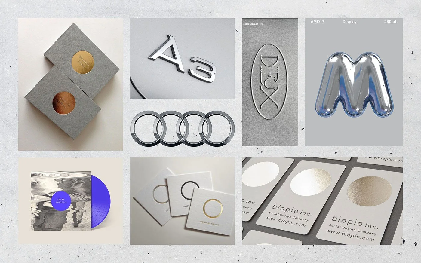
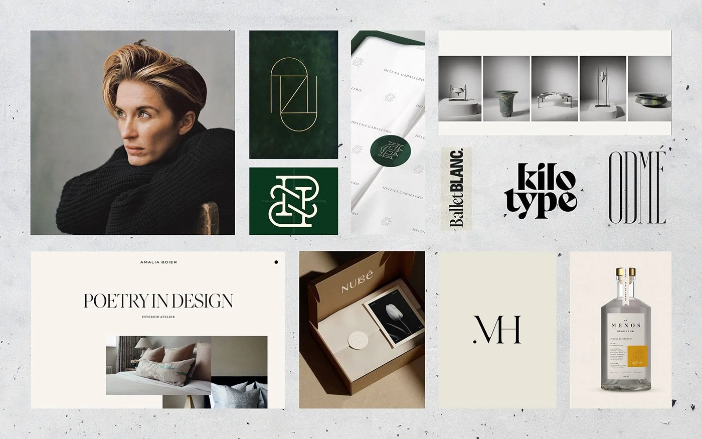
AUTHENTIC / INDIVIDUAL / AMBITIOUS / LOYAL / PROFESSIONAL
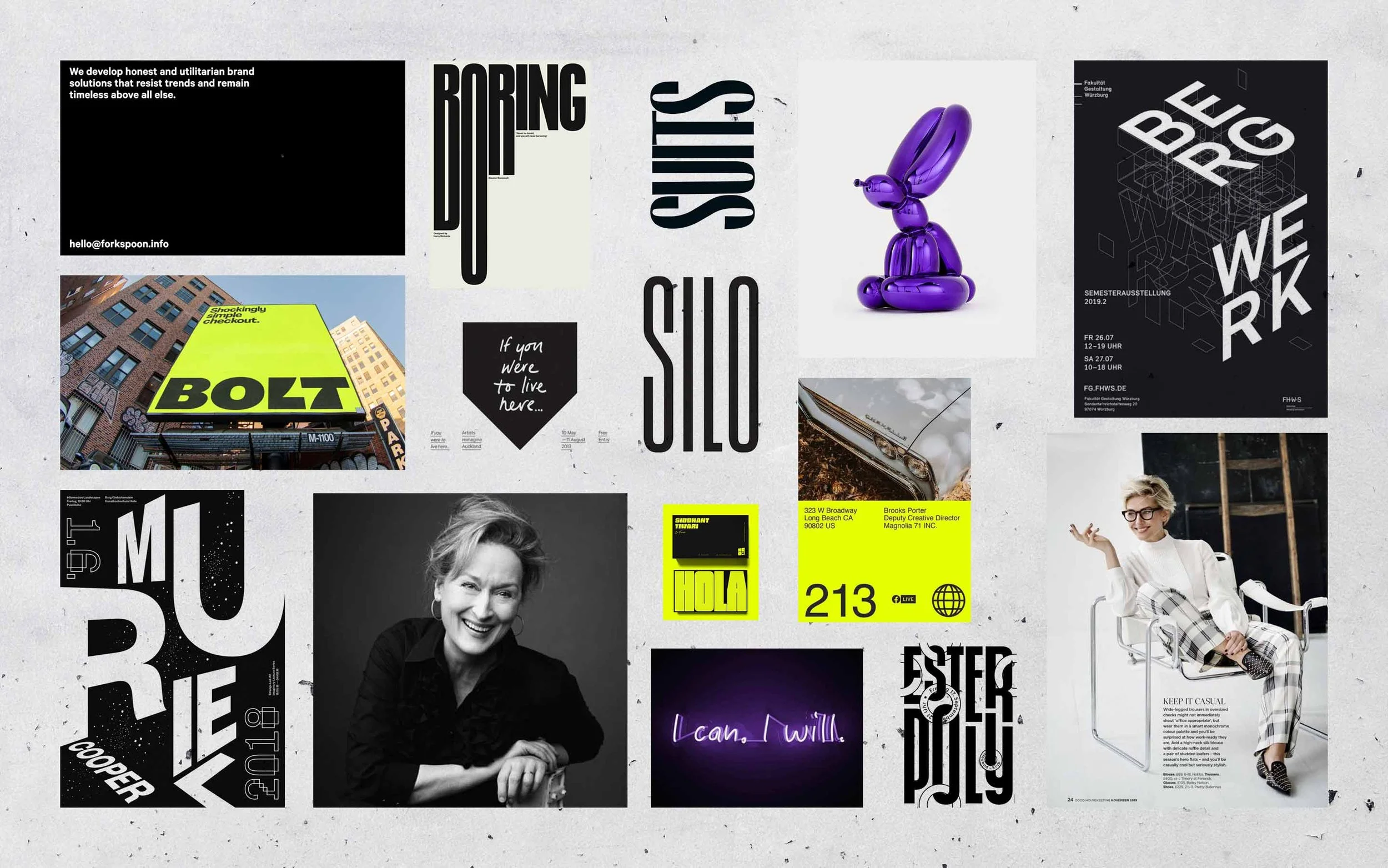
The typography treatments reference with letters in perspective are on different planes, showing how The Agency Cleo see things from all different angles. Also reference a structure being built, showing how you create events from start to finish and bring events to life. Other typographic styles stand tall showing how Cleo is on the rise and interlocking letters represent working together and the integrity you have as a business.
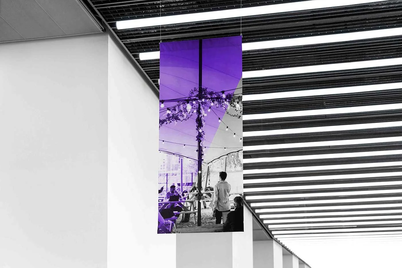
The photography shows people who are sure about themselves and the pose they have is at ease.
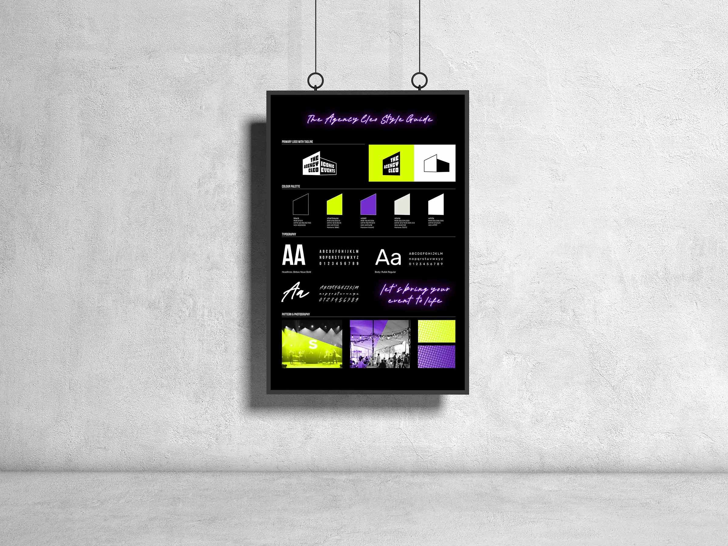
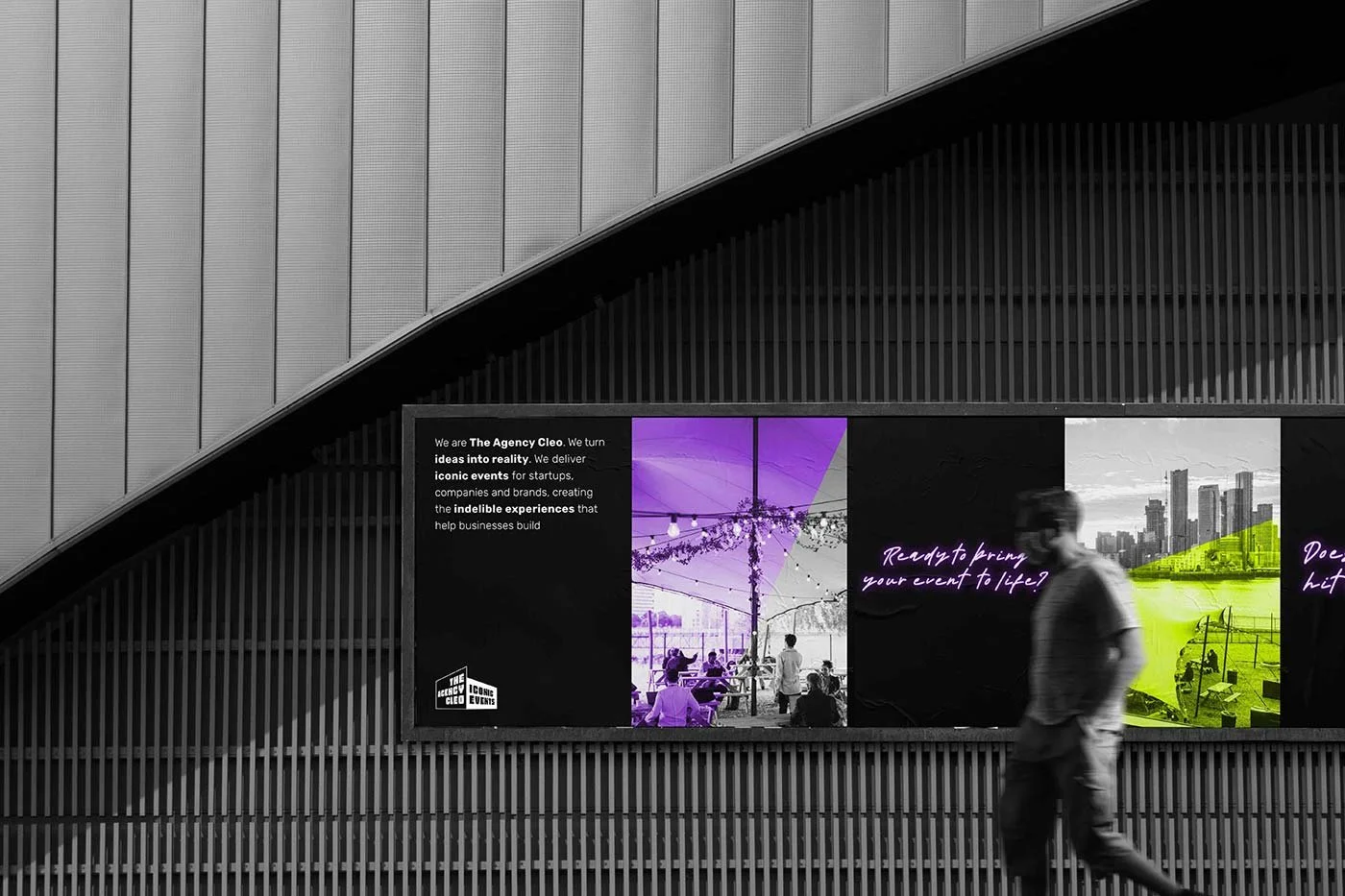
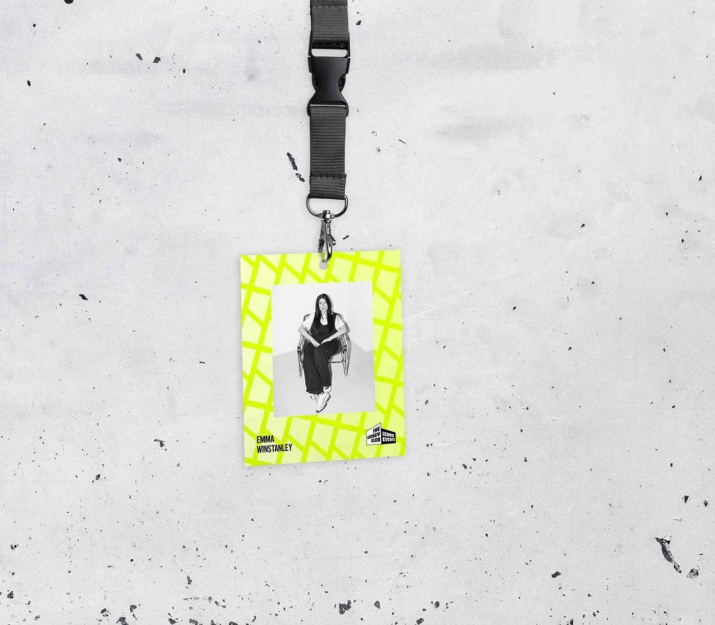
The colour scheme is a modern take from Cleopatra’s world, instead of luxurious gold, vibrant chartreuse is the choice. Deep black for sophistication and depth. Purple is included as an accent as Cleopatra is famously said to have dyed the sails of her royal barge completely purple to display her immense wealth, divine status, and dramatic flair when meeting Roman leaders.
While handwritten type lends a human feeling, it is paired with large bold sans serif type to talk loudly for different messaging.
BRAND IDENTITY: The design process
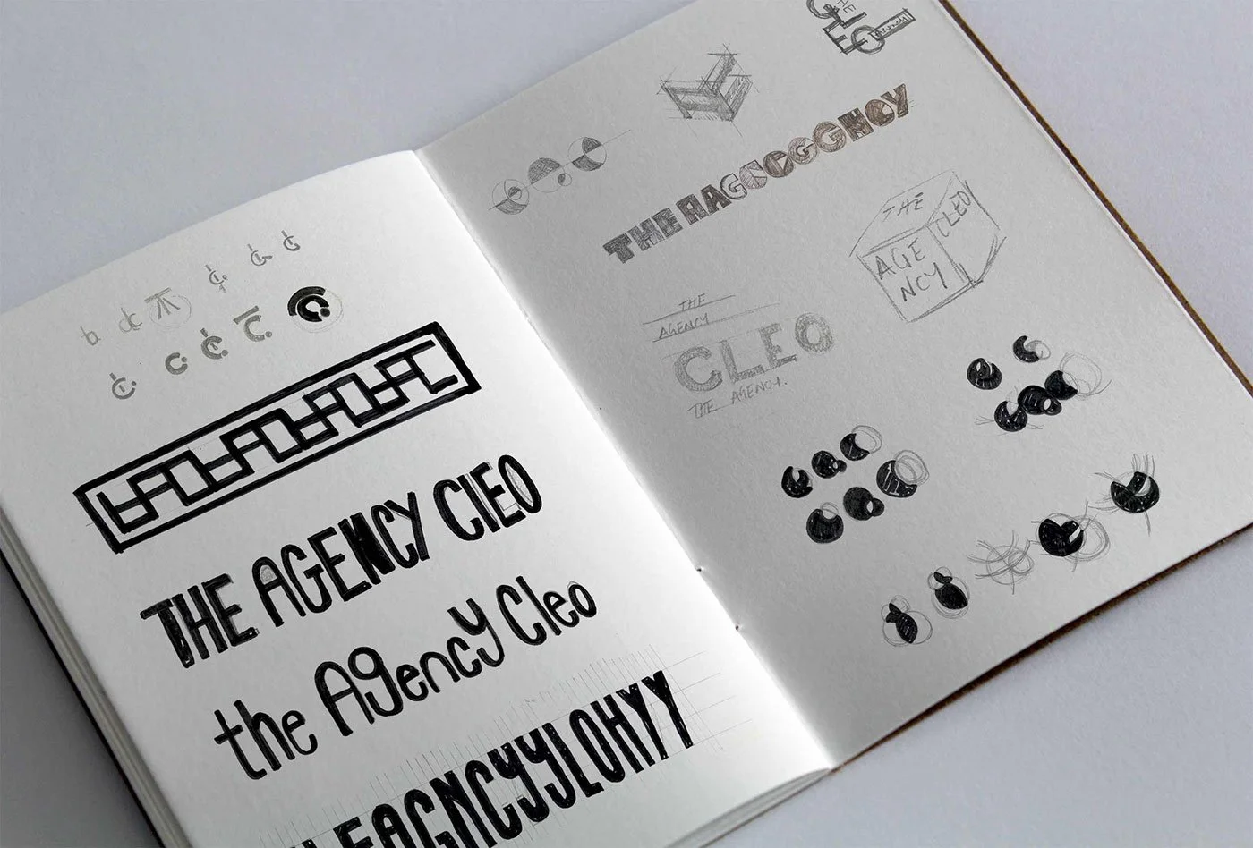
SKETCHES
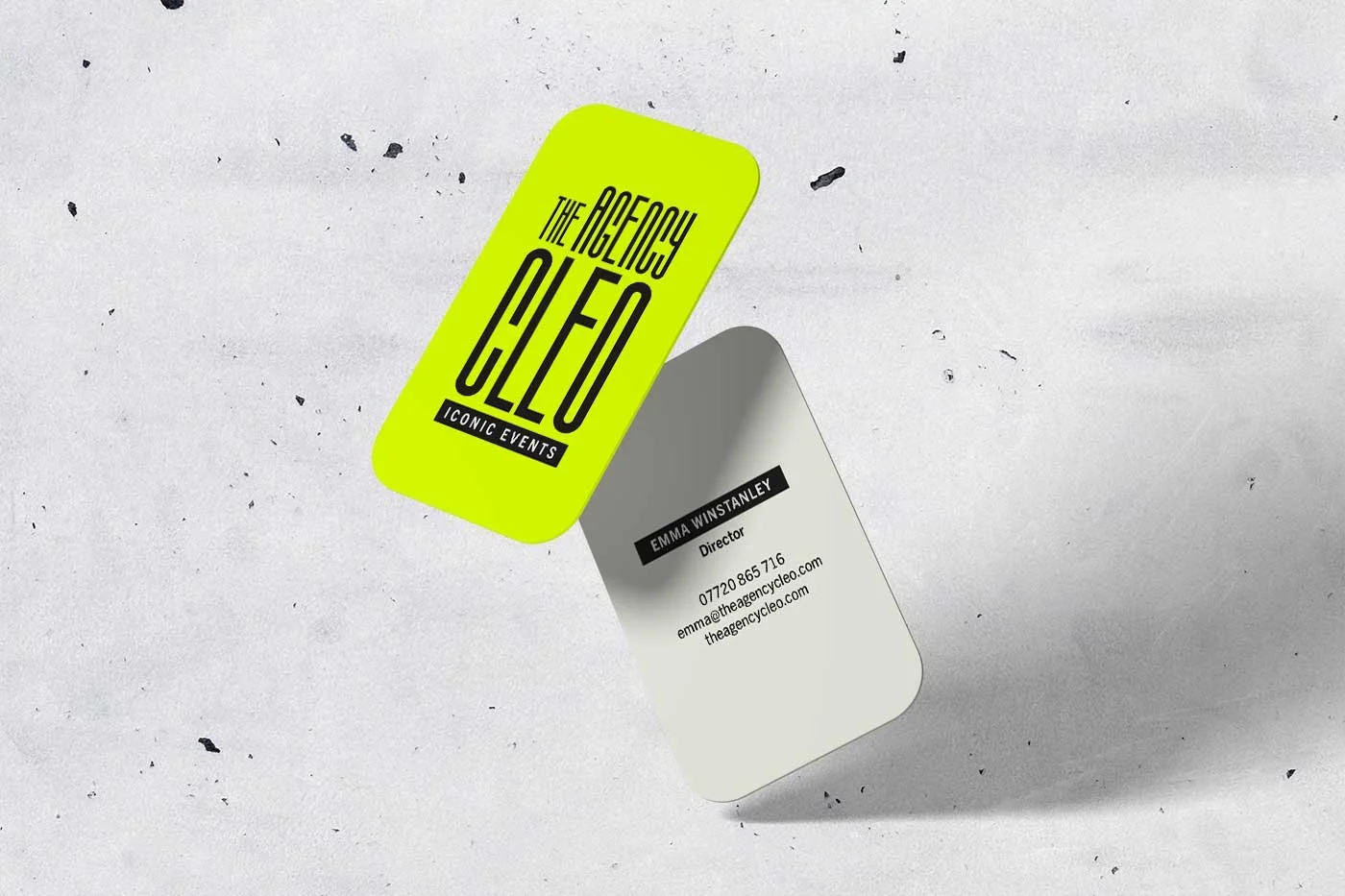
CONCEPT 1
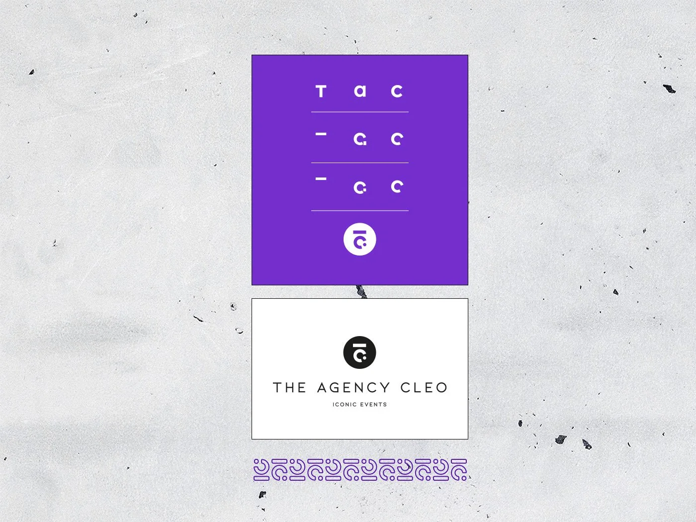
CONCEPT 2
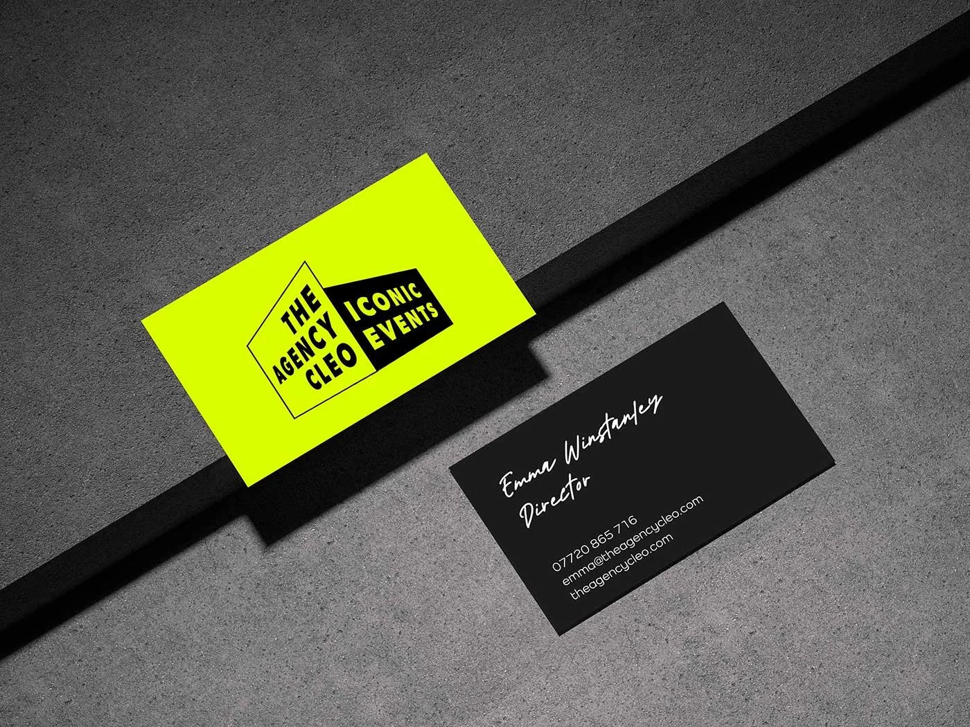
CONCEPT 3 - CHOSEN ROUTE
CONCEPT REFINEMENT
BRAND IDENTITY: The solution
THE SOLUTION
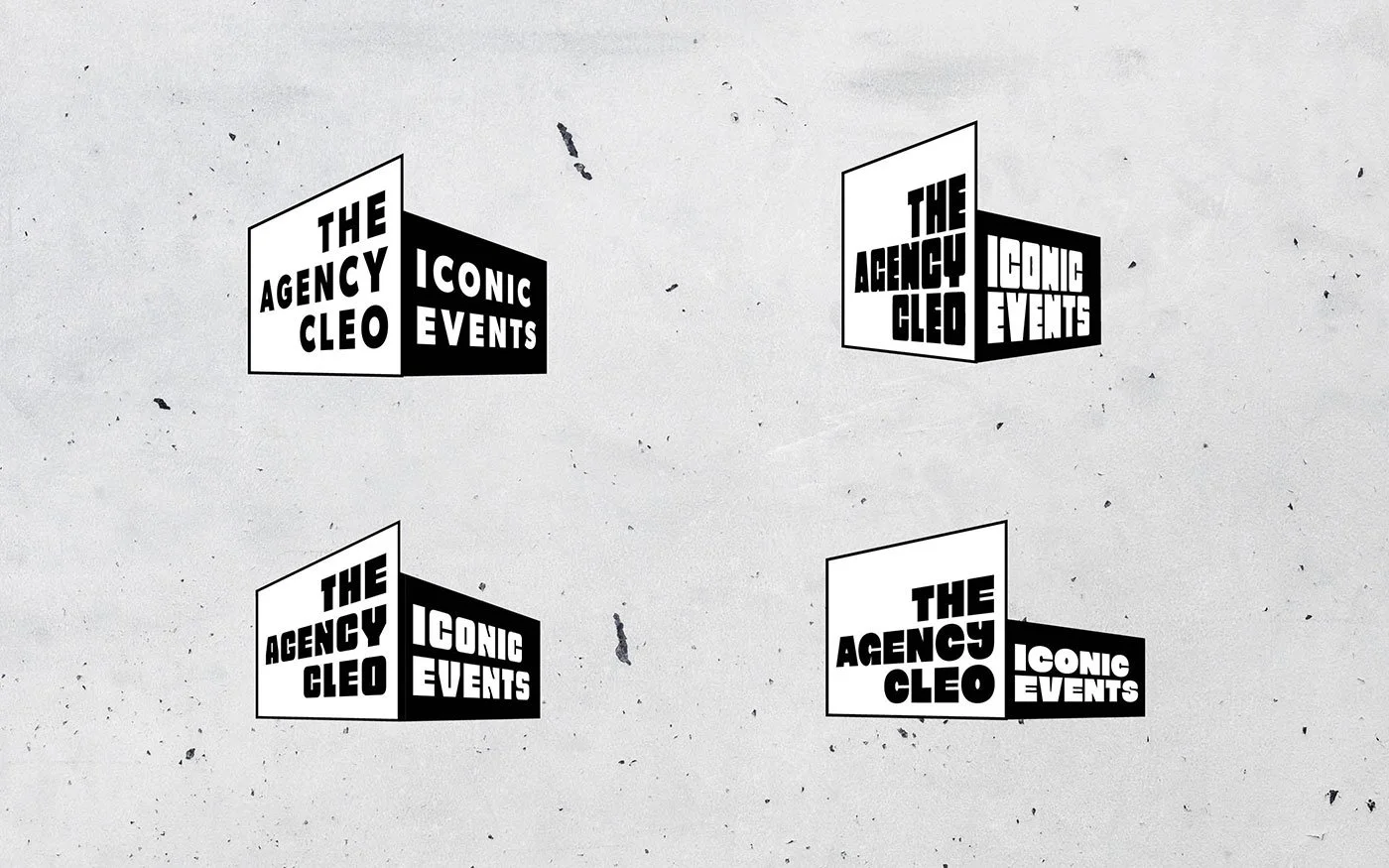
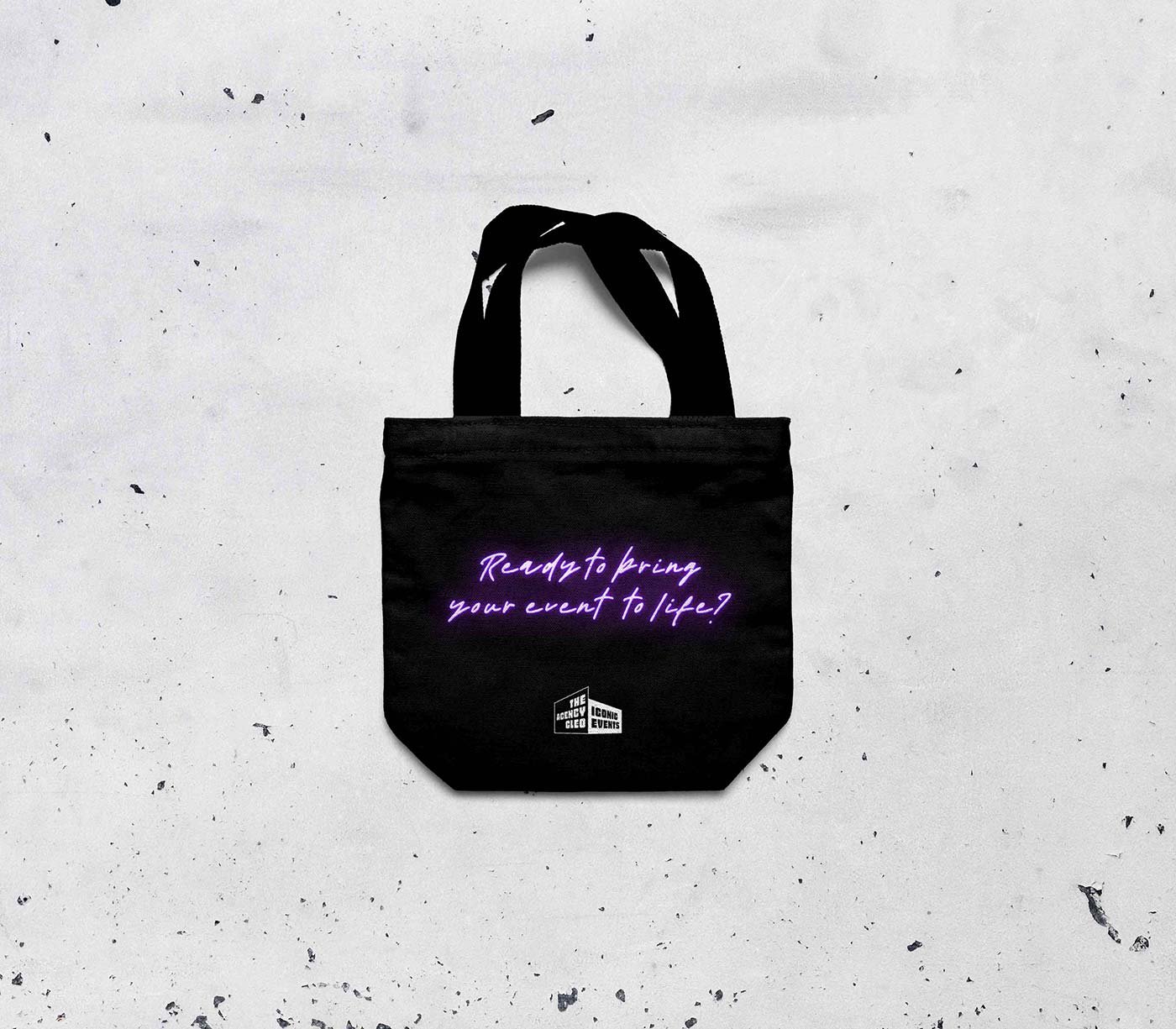
This approach visually demonstrates how your business sees things from all angles and puts a priority on progress. The perspective of the logo makes reference to Cleo tackling challenges from every side. Pairing it with the tagline lends further impact while creating the idea of a building in 3D.
The dynamic shapes from the logo have been used as accents over imagery and combined into interesting patterns to create further brand elements.
The fonts shown on the additional assets offset the logo’s bold sans serif. A handwritten font has been used sparingly to add a human touch and a feeling of fun, as seen on the business card.
A glowing purple handwritten font has been used to add a touch of glamour.
RESPONSIVE SQUARESPACE WEBSITE:
Design & build
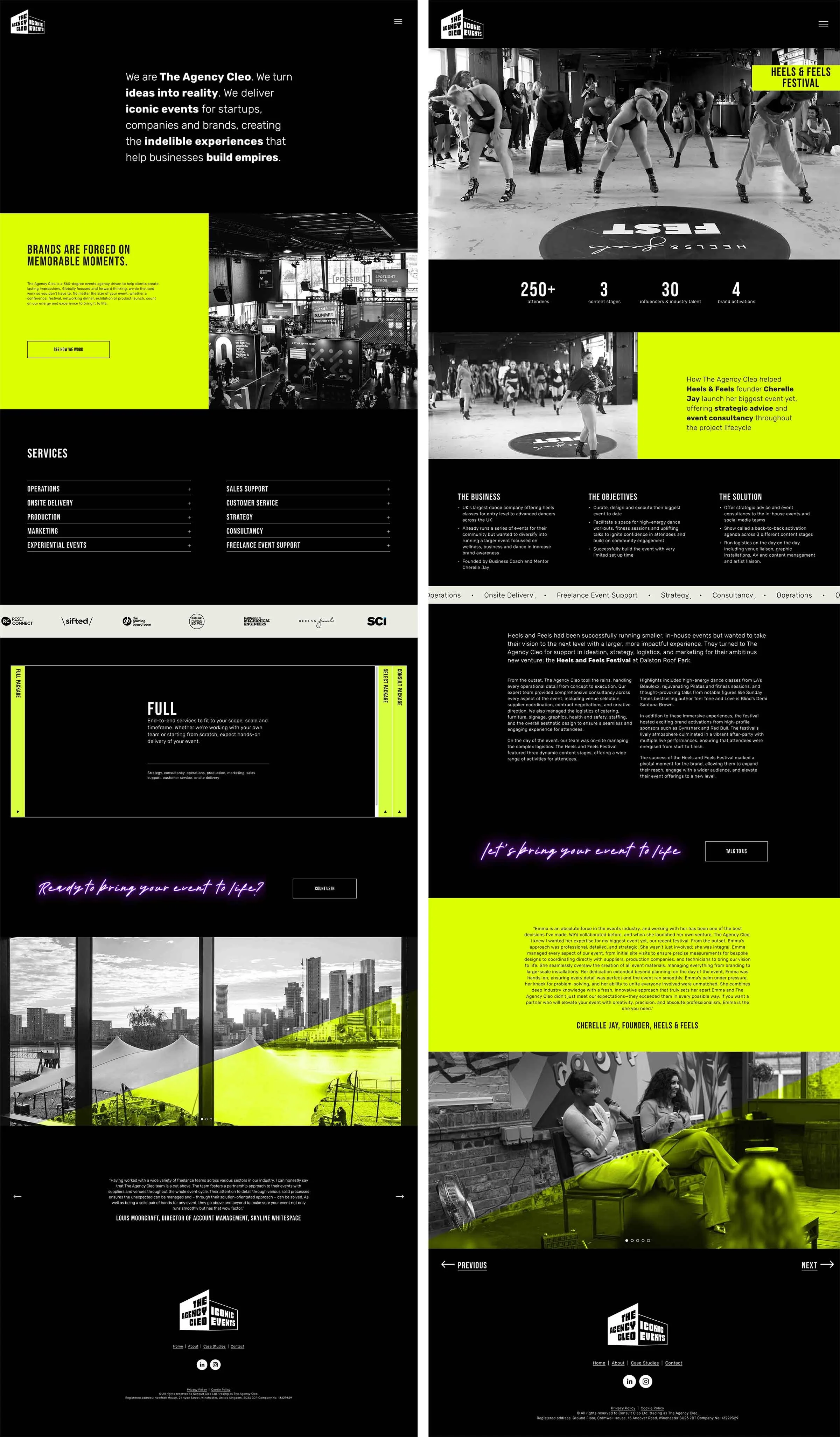
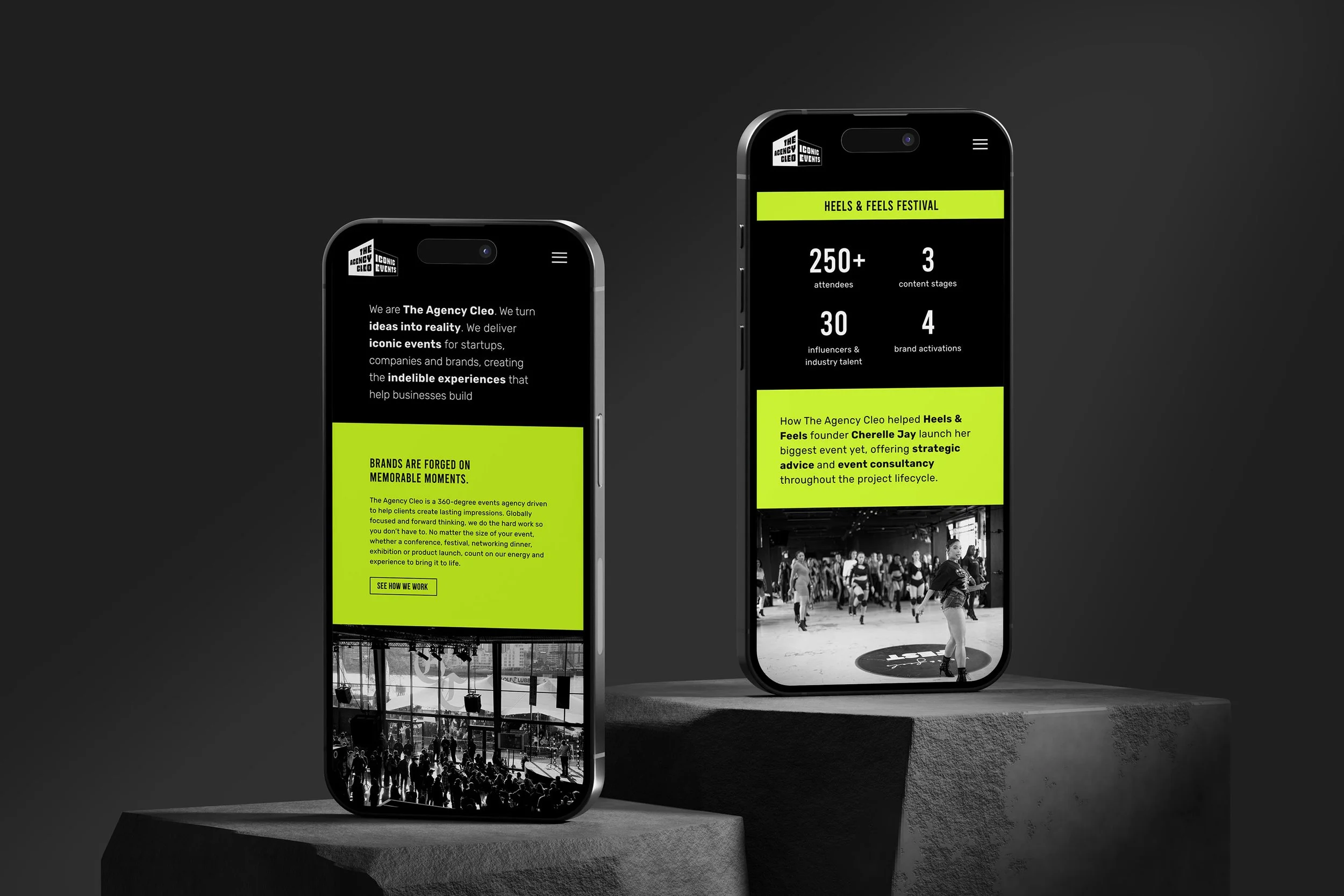
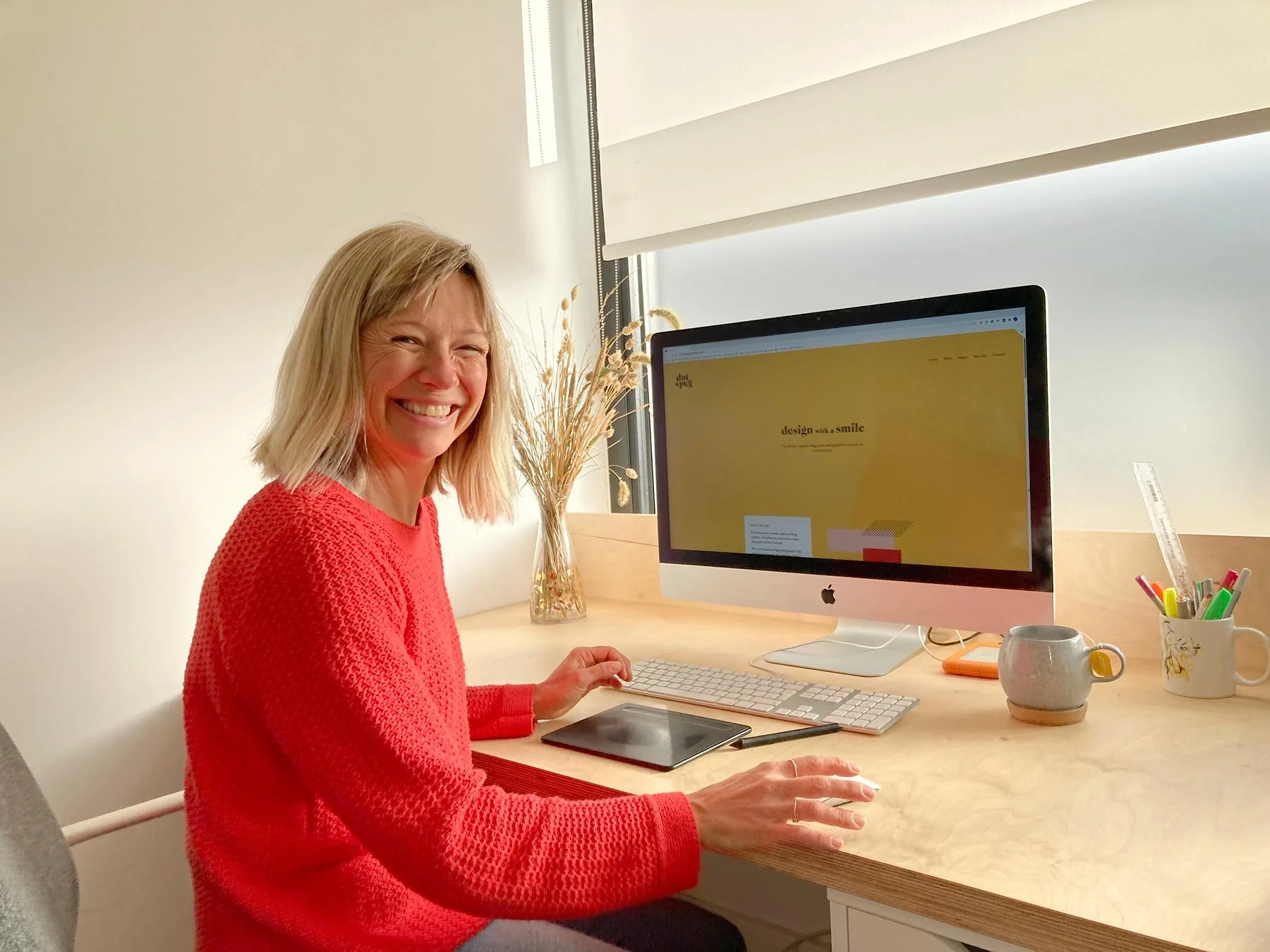

Laura has been an absolute game-changer for us at The Agency Cleo. From the very beginning, she took the time to truly understand our vision and brand. Her creative expertise shined through every step of the process—from the design and development of our stunning new website to the seamless execution of our complete rebrand. She brought our ideas to life in ways we hadn’t even imagined. She was professional, collaborative, and dedicated to delivering a brand and website that exceeded all expectations. We couldn't be happier with the results and highly recommend her for anyone looking to elevate their brand.
— Emma Winstanley, Founder, The Agency Cleo


Want to go on an adventure so exciting you’re already deciding what to pack?
Branding, Squarespace websites or both